Washington State Ferries, the largest ferry system in the US, serving over 1 million riders
1 million ferry riders. Zero prior user research. I led the first-ever usability study on the WSDOT iOS ferry app, found out why users were leaving for third-party apps, and delivered validated design recommendations their team could act on immediately.
The first usability study ever run on the WSDOT ferry app.
How might we surface the right information at the right moment, so riders never need to leave the WSDOT app?
3 in 5 new users dropped off after first use. 50% were switching to third-party apps mid-task. Zero prior user research existed.
Users weren't failing because features were missing. They were failing because the app spoke the system's language, not theirs.
The redesigned screens — before you read the process.
Route-first discovery — Surfaces relevant routes upfront, helping users find what they need faster without scanning long lists.
Contextual booking actions — Book tickets and reserve vehicles now directly within route details, reducing backtracking and simplifying decisions.
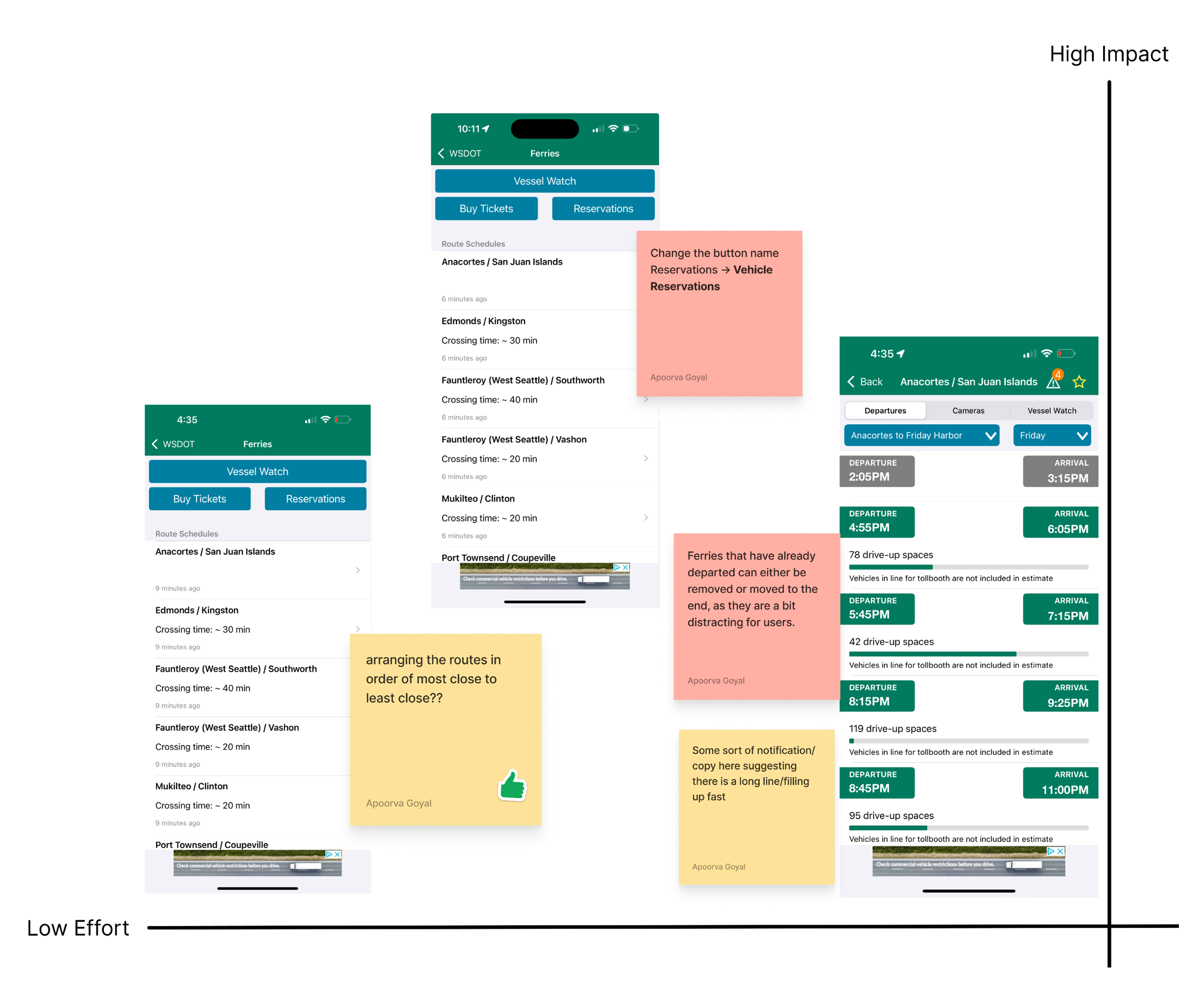
Information clarity — Ambiguous labels replaced with intent-specific language. 'Reservations' became 'Vehicle Reservation', drive-up spaces now show live counts, so users always know what each action does.
Working within WSDOT's existing system wasn't a limitation. It forced a sharper question: what do riders actually need at the moment they need it?
Annotated screens moved WSDOT stakeholders faster than any written report. Knowing your audience is half the design work.
All 27 findings would have been validated, not just 7. The research was complete for all of them. Given more time, every finding gets a redesign, a test, and a measured outcome.
11 users tested the original app in Round 1. In Round 2 A/B testing, 5 new users tested the original app and 5 tested the redesigned screens. Same tasks, same scenarios. Here is the difference.
Faster task completion, Group B vs Group A, timed across identical tasks
Fewer errors during ticket purchase, Group B vs Group A, directly observed and logged
Higher satisfaction scores, Group B vs Group A, measured via rating scale at end of session
Group A switched to FerryFriend mid-task. Group B completed the same tasks entirely within the WSDOT app.
Washington State Ferries, the largest ferry system in the US, serving over 1 million riders
The data below was provided by WSDOT. The research set out to find what was driving it.
WSDOT's analytics showed where users dropped off. Nothing explained why.
FerryFriend, Blue Sky, Marine Tracker. Users were leaving mid-task and WSDOT had no visibility into the reason.
No sessions, no recordings, no benchmarks. Starting from zero with no baseline to compare against.
Recurring complaints about confusing navigation and misleading labels. Patterns WSDOT could see but couldn't diagnose.
What What problems are users running into when using the ferry services feature on the WSDOT app?
Why Why are users facing those problems?
How How might we fix these problems within the system WSDOT already has?
21 participants recruited across four distinct rider types chosen to reflect the real range of people who depend on the WSDOT ferry app.
Rides the ferry to work 4 to 5 times a week. Knows the routes and relies on the app for live schedules and ticket purchase.
Takes the ferry a few times a month for errands or leisure. Familiar with the system but not a frequent app user.
Visiting or passing through. Unfamiliar with the ferry routes and using the app for the first time.
No prior experience with the ferry system or the WSDOT app.
The app was designed for discovery, but most users were not discovering. They were returning. An alphabetically listed A to Z route list optimises for a first-time visitor. 68% of users were not first-time visitors.
The app used backend language, not user language. "Reservation" means something to a developer. To a rider standing at a terminal, it means nothing distinct from "Buy Ticket," and that ambiguity cost them the booking.
The biggest UX problem was not missing features. It was invisible ones. Vessel tracking existed. Drive-up space counts existed. Users simply never found them. Findability was the product gap, not functionality.
Shifted from an information architecture problem to a decision-making clarity problem. The app had most of the right features. They just weren’t findable or understandable at the moment users needed them.
The full process: how the problem was uncovered, what got built, and what the data proved
Diagnose first. Design second.
Understand the product, the users, the problems, and why they existed, before touching a single screen.
WhyWith no prior research, the system had to be understood before the right questions could be formed.
WhyThe interaction map gave hypotheses. Stakeholder conversations gave ground truth. Knowing what WSDOT already suspected meant the research could confirm or challenge it directly.
WhyWho you test with shapes what you find. Social media for reach, prior WSDOT participants for credibility, personal networks for speed. Each channel targeted a different rider type. Session guidelines shared in advance so participants arrived prepared.
WhyNo analytics shows you what a real person does when confused. Scenarios were built around the core jobs: find a route, check schedules, book a ticket. Observed without intervening. That behaviour was the evidence WSDOT needed to act.
Round 1 sessions in progress. Participants sharing their screens over Zoom while navigating the live WSDOT app
WhyRaw observations are noise without structure. Notes were grouped by similarity, clusters named, and themes synthesised, turning scattered session quotes into a clear, prioritisable picture of what was failing and why.
"I wish there was a search. I can never find my route quickly."
"I didn't even know you could track the ferry live in this app."
"I have to go all the way back just to buy a ticket. By then I've forgotten which time I was looking at."
"FerryFriend just shows me what I need. The WSDOT app is confusing."
WhyWith 11 weeks total and Round 2 still ahead, we couldn't design for everything. Impact-effort scoring gave a defensible way to choose, and gave WSDOT a clear roadmap for the findings that couldn’t be reached.
Full Impact–Effort Matrix — all 27 findings mapped
High impact · Low effort — the 7 findings taken to redesign
The research was clear: users weren't failing because features were missing. They were failing because navigation was opaque, labels were misleading, and actions were disconnected from context. That reframing drove every design decision.
How might we surface the right information at the right moment, so riders never need to leave the WSDOT app?
27 findings. 7 prioritised for redesign and validation. A report ready to hand over.
But handing over findings isn't the same as proving they work. So I didn't stop there.
Hand WSDOT a report and walk away. Will it actually change anything?

HowEvery fix worked within WSDOT's existing colors, components, and patterns. A search bar introduction, alphabetical route reordering, clearer vehicle reservation copy, drive-up space label and color fix, and a prominent buy now button, among others. Nothing required a redesign budget.
PrototypeThe redesigned screens were built as a high-fidelity interactive prototype — participants could search for routes and reach real results, and favourite a route to see it surface at the top of the schedule. Not static screens. Real tasks, real interactions.
ResultEvery problem area that had failed in Round 1 showed measurable improvement in Group B. 26% faster task completion, 47% fewer errors, 68% higher satisfaction. The errors weren't just reduced. They were removed.

Round 2 sessions in progress. Participants testing redesigned screens via the high-fidelity prototype over Zoom
WhyA report only works if the reader knows exactly what to do with it. All 27 findings were annotated directly onto the existing app, marking where each problem lived. Every design recommendation was written with enough specificity for WSDOT's dev team to act in the next sprint.
Following delivery, WSDOT confirmed several recommendations are under active review for implementation. Changes are being introduced incrementally to minimise disruption to existing users, a direct outcome of designing within their existing system from the start.
Three problem areas. Three design decisions. Each comparison shows what changed and why it mattered.
Faster route discovery, post-redesign
Added search and surfaced routes by location, not alphabetical order
Surfaced location-aware routes and added search rather than forcing users to scan an alphabetical list. The most frequent action should require the least effort.
Correct status interpretation (up from 32%)
Rewrote labels to match what users were actually trying to do
Replaced ambiguous labels with intent-specific language and removed visual noise. Users make faster decisions when copy matches their mental model.
Fewer errors. 2 fewer steps to checkout.
Moved booking into the schedule screen, cutting 2 steps from the flow
Moved booking inline with the schedule. Interrupting a user’s context to complete a related task is a flow failure, not a navigation pattern.
Users consistently looked for their most-used routes first, but the original app’s global favourites, spread across ferry, mountain passes, and other services, made them hard to find and easy to ignore. Most participants didn’t rely on it at all. Ferry-specific favourite routes were surfaced directly at the top of the schedule.
Designing within WSDOT’s existing system forced the right question early: not how to restructure everything, but how to make the right things findable at the right moment. That reframe shaped every screen. The constraint didn’t limit the work. It defined it.
The team needed direction. WSDOT needed confidence. Annotated screens moved stakeholders where a written report wouldn’t. The finding wasn’t enough. The translation of it was. Format, framing, and who you’re talking to all shape whether the work lands.
Round 2 almost didn’t happen because the recruitment problem felt like a blocker to solve alone first. Raising both the idea and the concern with WSDOT directly changed the project’s outcome. Don’t assume the answer before asking the question.
Within 11 weeks, 7 high-impact findings were identified, redesigned, and validated through A/B testing. The research for all 27 was complete. Given more time, every finding would have gone through the same process: a redesign, a usability test, and post-launch measurement to confirm the impact held. The work proved the method. The remaining 20 findings are the natural next step.