Founding Product Designer Creative Technologist

Redesigned a fragmented clinical ECG platform for three user groups. From legacy software to a fully functional MVP responsive to all screen sizes, built using AI and prompt engineering.

I joined a medical device company as their founding product designer, the first designer they had ever hired. Six months later, I had expanded scope, aligned engineering on a full structural redesign, and shipped a role-based clinical MVP built in Figma Make. No design precedent. No playbook.

Jun to Nov 2025
Product Development Engineering
Figma Design & Figma Make

At a Glance

Cardea Solo is a clinical ECG desktop software used by cardiologists, ECG technicians, and administrators. A physical sensor worn by the patient connects to the software for heart monitoring and diagnostic reporting. With 30+ workflows across three distinct user groups, it is a complex clinical system where every design decision directly affects patient care.

🗂
User Group 1
Admin
Manages users, roles, patients and devices
🩺
User Group 2
ECG Technician
Attaches sensors, registers patients, generates reports
📡
User Group 3
Physician / Cardiologist
Reviews recordings, interprets findings, signs off reports
Initial Problem Statement

The UI is outdated. Modernize and update it.

Real Problem Statement — After UX Audit

The UI was old, but the real issue ran deeper. The workflows were broken at a structural level, fragmented across the system, with each user group navigating the same interface with no scoping, no separation, no logic. A visual redesign would not have fixed this. Each user needed a completely different system.

My Role

End-to-end Product Designer (0 → MVP)

UX Research Information Architecture Wireframing Design System Figma Make Prompt Engineering AI-assisted Design Interactive Prototype React Handoff
Drag to compare — What changed
Legacy Redesigned
After
Role-Scoped Access

Each user sees only the screens relevant to their job. Nothing more.

After
No Redundancy

Every action happens once, in the right place, for the right user.

After
Error Handling

Clear failure states with resolution guidance. No more silent failures.

After
Design System

Tokens, components, and visual consistency across every screen.

After
Fully Responsive

Adapts to all screen sizes. No more broken layouts on different hardware.

Before
Shared Interface

All three user groups accessed every screen regardless of role.

Before
Redundancy

Same actions repeated across multiple screens with no logical flow.

Before
No Error Handling

Failures happened silently. No feedback, no way to recover.

Before
No Design System

No tokens, no components, no visual consistency anywhere.

Before
Not Responsive

Fixed desktop resolution that broke on any other screen size.

AI Tools Used

AI compressed every phase: research, synthesis, build. I directed everything. The tools moved faster.

ChatGPT
Research synthesis, interview guides, and prompt refinement before Figma Make sessions
Figma Make ✦
Built the MVP from approved wireframes. Multiple design options, interactive prototype, and React base code output
Gamma AI
Stakeholder presentation decks throughout the project. I wrote the narrative first; Gamma produced the finished deck
Design Output

Three persona flows built end to end: from information architecture to interactive prototype to React handoff. Built through prompt engineering and a component library.

Cardea Solo — Interactive Prototype · All Three Persona Flows
Fully interactive prototype, responsive to all screen sizes
React
Base code handed directly to engineering for the entire system
Outcomes
3x
Faster report generation for cardiologists
100%
Of workflows redesigned with role-specific access
0
External tools. Everything lives inside the software.
0
Tab switching across the redesigned system
5→1
Redundant workflows consolidated into one
Reflection
The hardest moment

I was hired to make the UI look better. After the audit I went back to stakeholders and told them the real fix was a full structural redesign. That conversation changed the entire project.

What AI taught me

Writing a prompt for a clinical screen is no different from writing a design brief. The quality of what comes out is entirely dependent on how precisely you define what you need going in.

What this role was

No design team. No templates. Every process, every decision, every stakeholder conversation had to be built from nothing. That is what founding designer actually means.

The full story: research, structure, and how design system and prompt engineering became the build method.

01 / Research

I started by using the software myself. What I found changed everything.

Before speaking to anyone, I opened the software and started exploring on my own. I kept landing on the same screens through completely different paths. Actions that should have been distinct were looping back into each other. The redundancy was not a coincidence. Something structural was off. So I started mapping everything.

1
Finding the problem areas

UX Audit

A screen-by-screen audit of the entire system before speaking to anyone. Three workstreams ran in parallel to build a complete picture of what was actually there.

Information architecture map
User flow diagrams
Interaction map of the full system
→ Full system map and problem areas identified
IA Map · User Flows · Interaction Map Open in Figma ↗
Before: Legacy Software

What the audit uncovered: three user groups, one fragmented system, six structural failures.

LEGACY SOFTWARE Cardea Solo Built in the early 2000s THE ORCHESTRATOR Admin ROLEControls who uses the software and what their role will be No role-based access THE OPERATOR ECG Technician ROLESensor attachment, patient registration, generates preliminary report for physician review Multiple tabs opened for each task THE DIAGNOSTICIAN Physician / Cardiologist ROLEReviews preliminary report, validates or changes findings, signs off on diagnosis External PDF tool REDUNDANCY Same actions repeated across multiple screens BACKTRACKING Return to same screen for multiple scenarios SHARED INTERFACE All users access all screens NOT RESPONSIVE Fixed desktop resolution breaks on other screens NO DESIGN SYSTEM No tokens, no components, no visual consistency NO ERROR HANDLING Failures occurred silently. No feedback, no resolution path.
2
Understanding why they existed

Interviews

Five stakeholder groups, each with a completely different picture of the same product. The interviews validated what the audit surfaced and filled in the why behind every friction point.

Software engineers
QA testers
Product managers
Customer support
End users: Admin, ECG Technician, Physician, Cardiologist
→ Audit findings validated and brief locked
02 / The Real Problem

The initial brief said modernize the UI. What the audit found became the reason for the pivot.

Every user group, Admin, ECG Technician, and Physician, was navigating workflows that were fragmented across the entire system. The UI looked broken because the structure underneath was broken. A new UI would have made it look better, but the software would have worked exactly the same. Engineering wanted a reskin. I pivoted to advocate for the users.
How I convinced stakeholders for the pivot

I turned every audit finding into a case for a broader scope by:

1
Mapping every pain point to a structural root cause, not a visual symptom
2
Presenting to engineering, product, and leadership with evidence, not opinion
3
Securing a greenlight for a full UX and UI redesign. Scope changed entirely.
03 / Who I Designed For

The pivot gave me a mandate. Three users. Three scoped interfaces. Zero overlap.

Getting the greenlight meant starting at the structure, not the screens. I rebuilt the information architecture from scratch, mapped each user's job to their own scoped interface, and got stakeholder sign-off before a single wireframe was drawn.

After: Redesigned MVP
REDESIGNED MVP Cardea Solo Role-based login. Scoped screens. No overlap. THE ORCHESTRATOR Admin ROLEControls who uses the software and what their role will be Scoped access Audit log THE OPERATOR ECG Technician ROLESensor attachment, patient registration, preliminary report Device state visible 1-click handoff THE DIAGNOSTICIAN Physician / Cardiologist ROLEReviews preliminary report, validates or changes findings, signs off on diagnosis PDF in-app NO REDUNDANCY Optimised workflows no repeated actions BREADCRUMB FLOW User always knows where they are and what to do next ROLE-SCOPED ACCESS Each user sees only what they need FULLY RESPONSIVE Adapts to all screen sizes DESIGN SYSTEM Tokens, components, visual consistency ERROR HANDLING Clear failure states with resolution guidance
FigJam Board — Information Architecture · Redesigned MVP
After — Information Architecture · Role-scoped MVP
Open in Figma ↗
FigJam · After — Information Architecture Scroll to zoom · Drag to pan inside the board
How each workflow was built

With the IA approved, each workflow followed the same loop. Steps 02 and 03 repeated until stakeholders signed off. Nothing moved into Figma Make until it was.

01
Define
Once · IA + Brief
·Rebuild MVP IA from scratch
·3 persona maps
·Optimized workflow maps
·Brief locked by stakeholders
Output → Approved IA
↺ LOOP
02
Wireframe
Repeats · Figma Design
·One direction per flow
·Edge cases included
·Lo-fi only, no polish
Output → Lo-fi wireframes
↺ LOOP
03
Validate
Repeats · Stakeholders
·1:1 and group sessions
·Iterate on feedback
Back to 02 if not approved
Gate → Stakeholder sign off
04
Build
Once approved · Figma Make ✦
·Multiple options per flow
·Interactive prototype
·React code output
Output → Prototype + React
ITERATE UNTIL SIGN-OFF VALIDATE FIGMA MAKE DESIGNS
04 / Solution

What I built for each user.

With the IA approved, I took one primary workflow per user and designed it end to end. User flow first, then wireframes, then into Figma Make.

User Flow — Admin
100%
User Flow — Admin
+ / − to zoom · Drag to pan
Wireframe — Admin
100%
Wireframe — Admin
+ / − to zoom · Drag to pan
After
Information categorised One flow for all user types Password mandatory Responsive to all screen sizes
Redesigned — Admin
Before
All info on one screen Separate flows to add each user type No password required Fixed window, not resizable
Legacy flow — Admin
User Flow — ECG Technician
100%
User Flow — ECG Technician
+ / − to zoom · Drag to pan
Wireframe — ECG Technician
100%
Wireframe — ECG Technician
+ / − to zoom · Drag to pan
After
Role-based access Self-managed account activation Zero tab switching 30% fewer registration steps
Redesigned — ECG Technician
Before
No role-based access No self-service account management New tab on every record
Legacy flow — ECG Technician

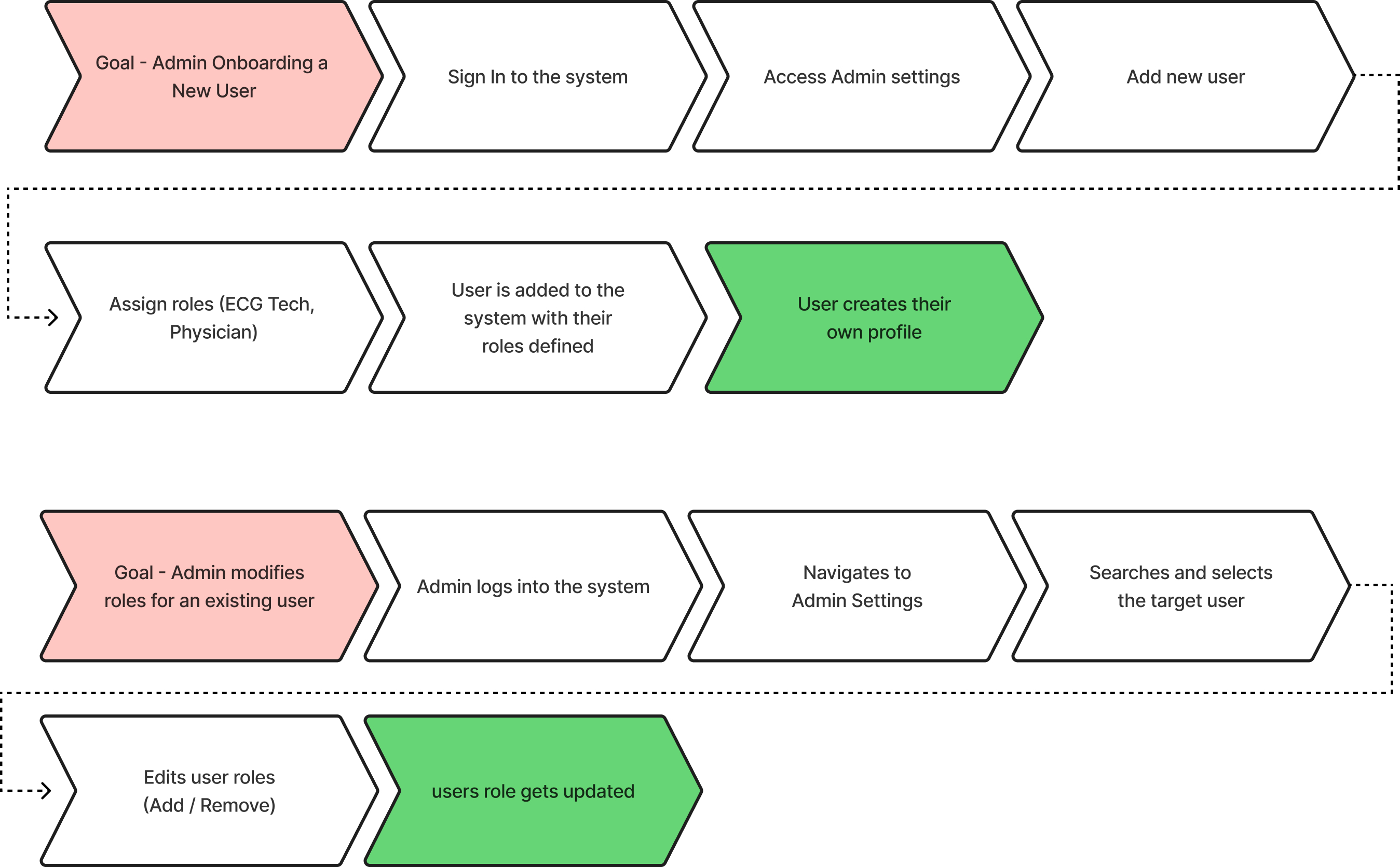
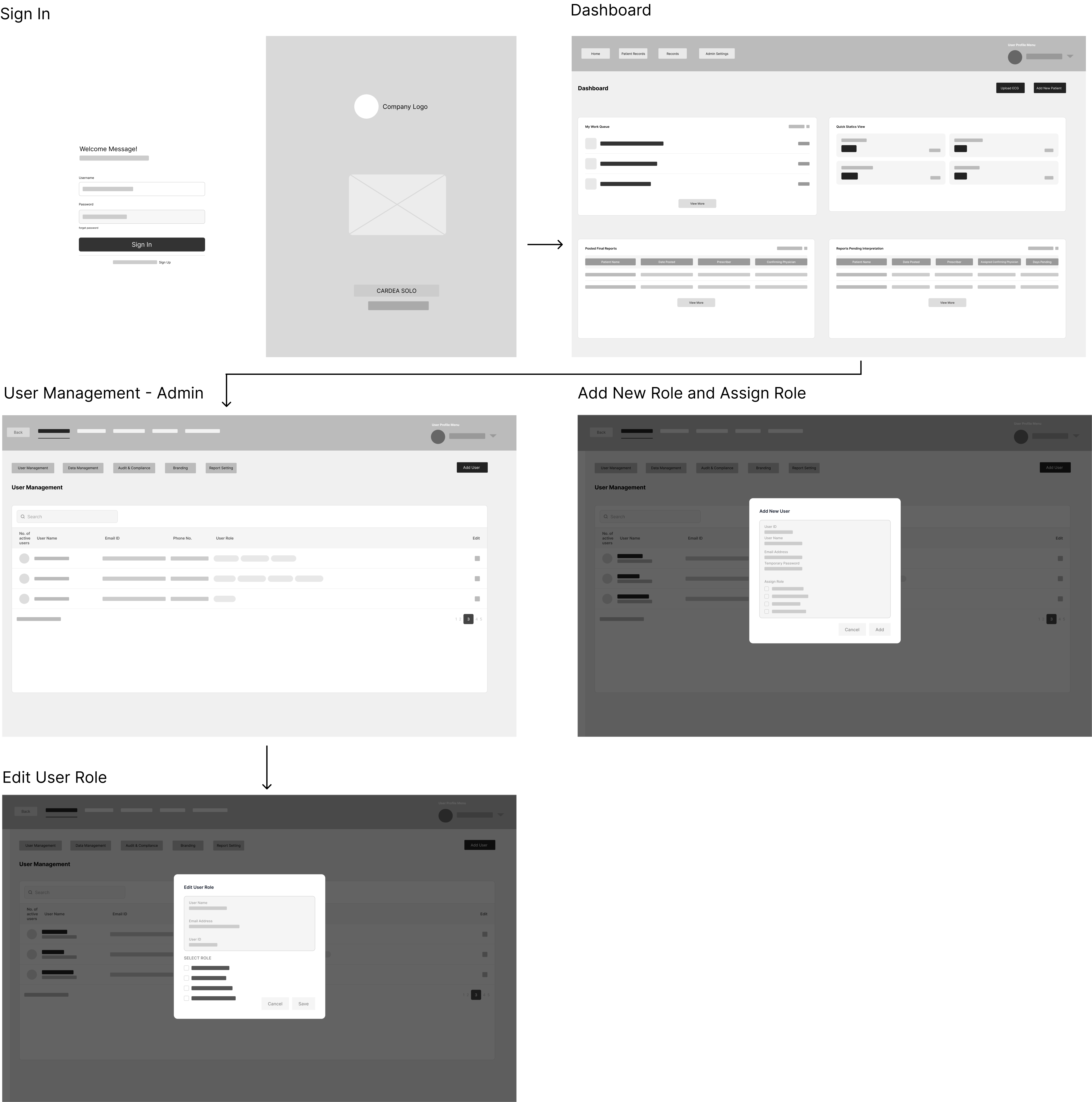
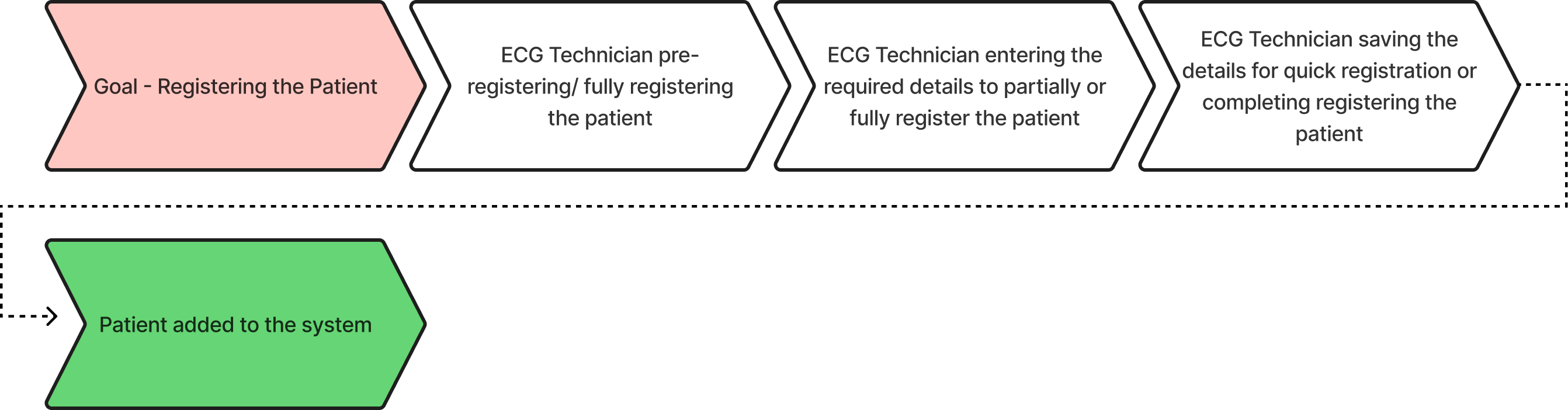
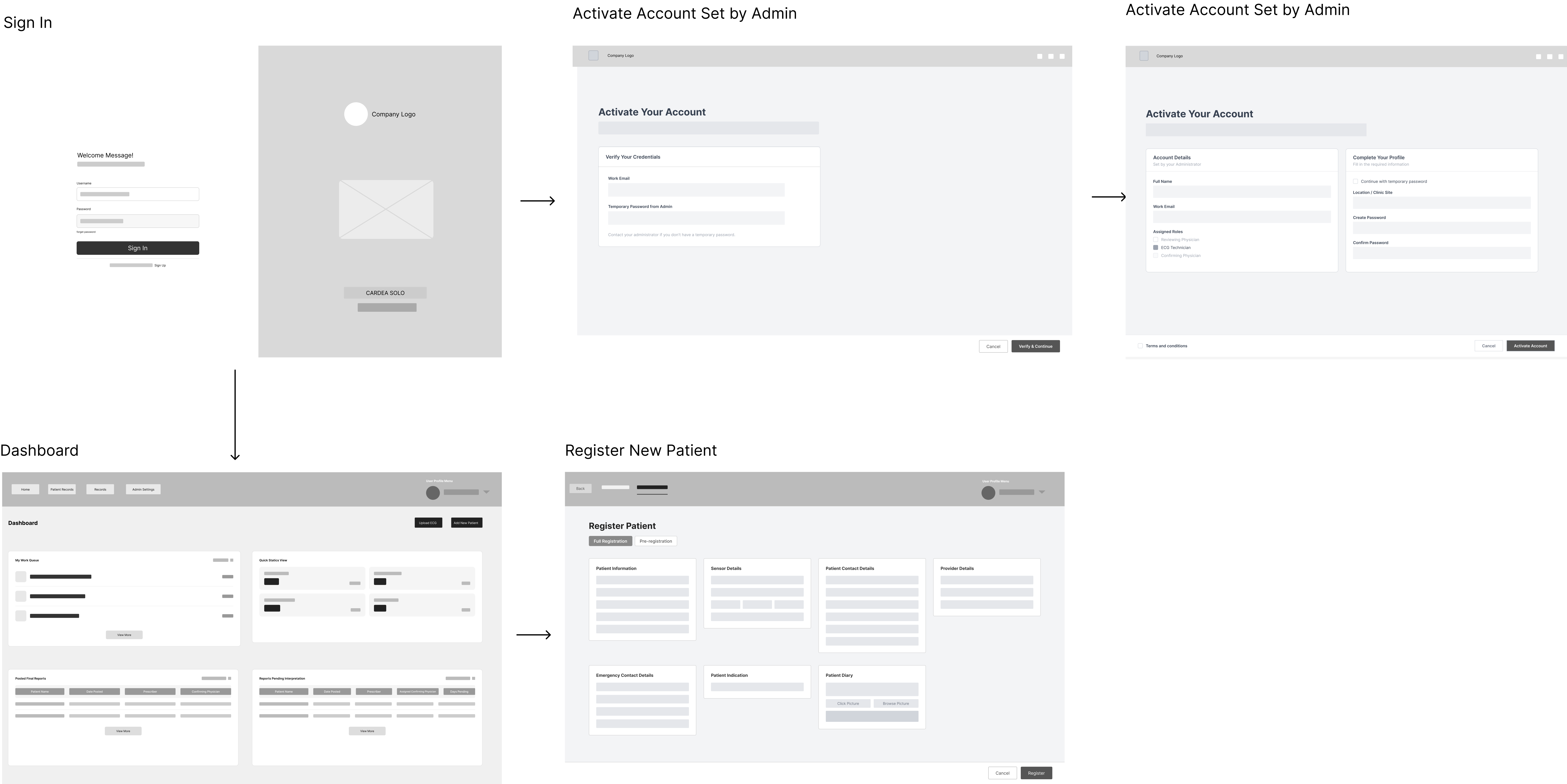
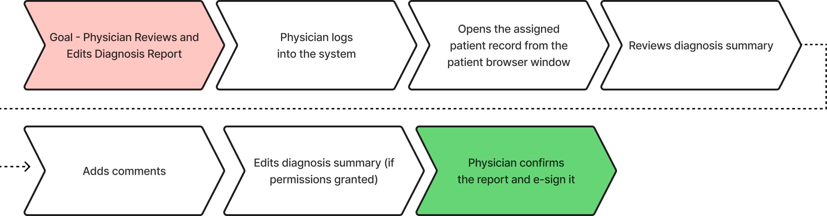
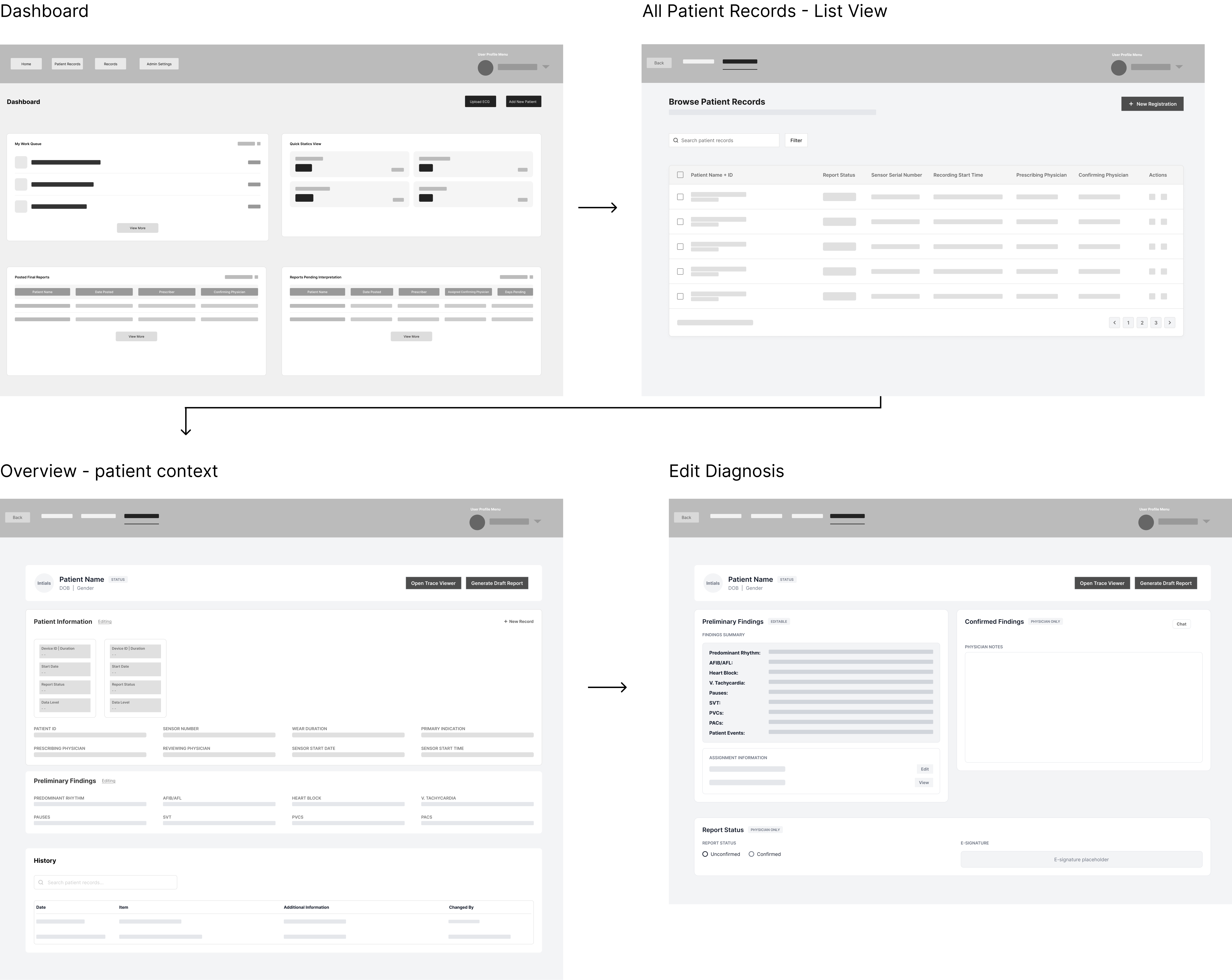
All individual workflows were built separately for each role. Once complete, they were stitched together into one unified system.

05 / Build Method

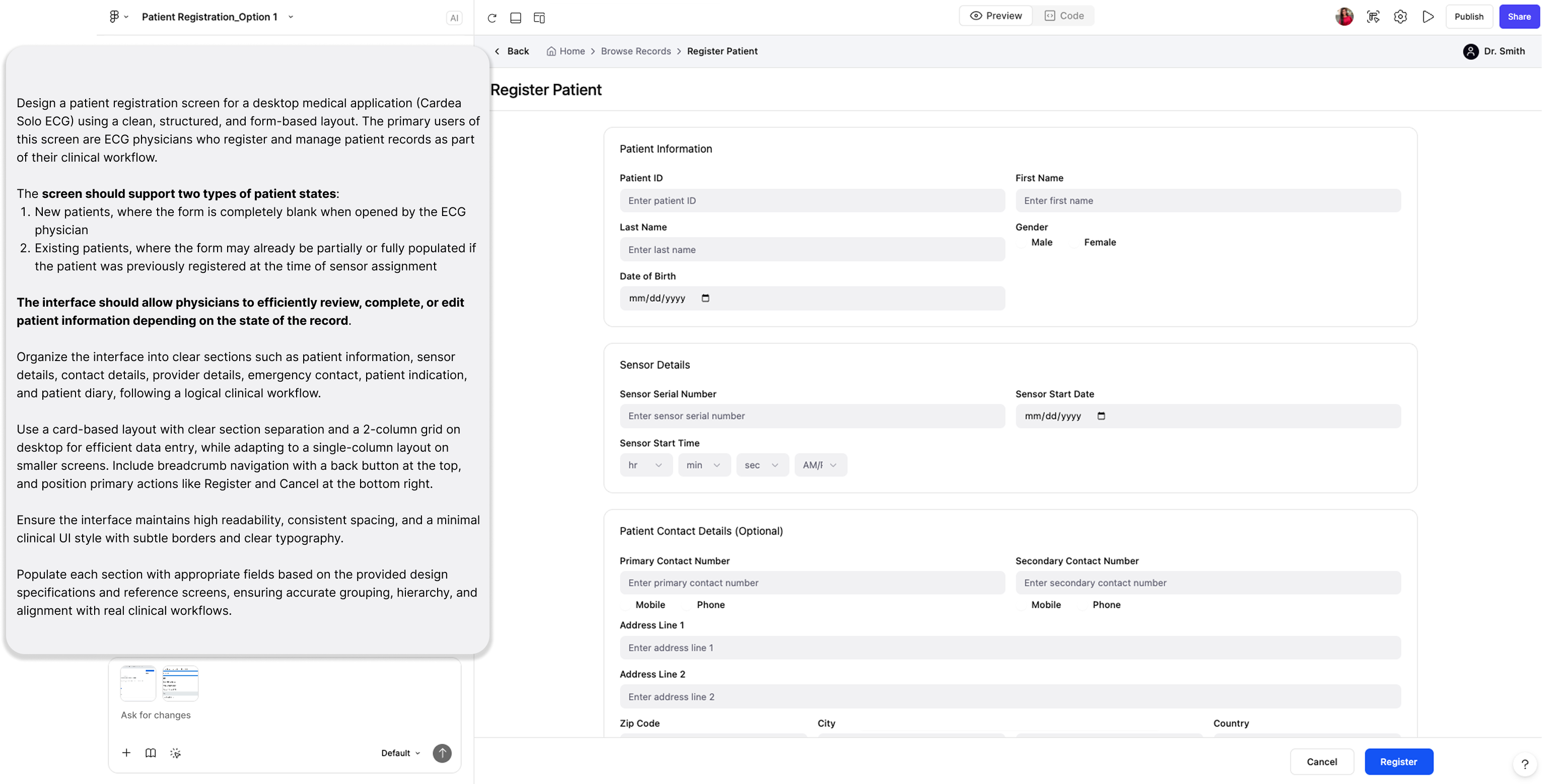
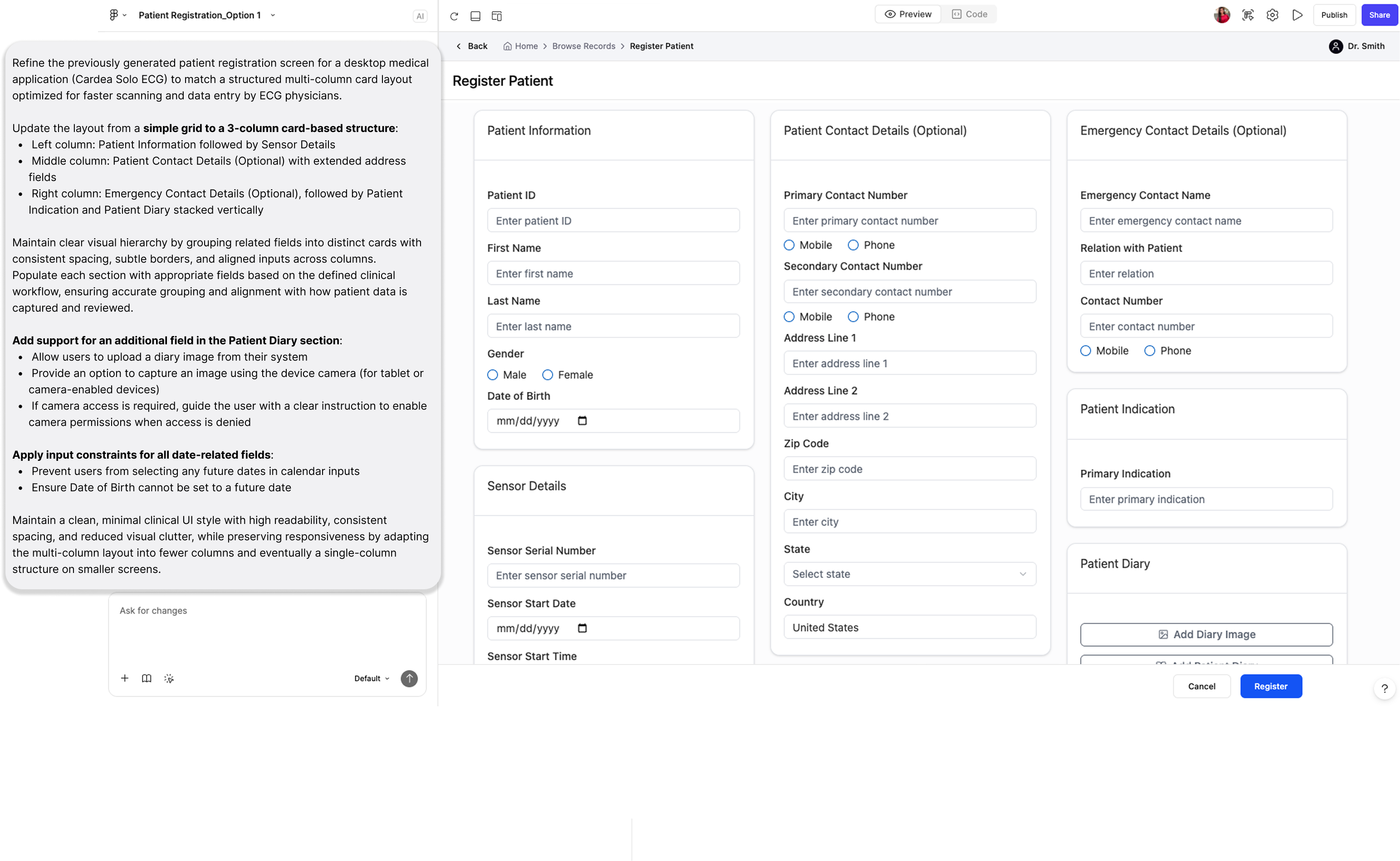
Figma Make generated the starting point. My judgment built the system.

I used Figma Make to generate UI fast — then audited every output, corrected it in Figma Design, and locked those decisions as components. That loop is what built the component library.

The loop: every screen, every session
1
Prompt: full design brief
Persona, use cases, layout, interaction logic, backend behaviour. A miniature spec, not a generation request.
2
Edit: real design decisions
Spacing, hierarchy, interaction states — corrected directly in Figma Design.
3
Lock: reusable components
Corrected output became the source of truth. Inputs, nav, cards, standardized.
4
Reuse: consistency maintained
Every new screen started from a more refined foundation. Less correction each cycle.

AI accelerates execution. It does not replace judgment. The tool did not build the system. Repeated, deliberate decisions did.

The prompts in practice: Patient Registration

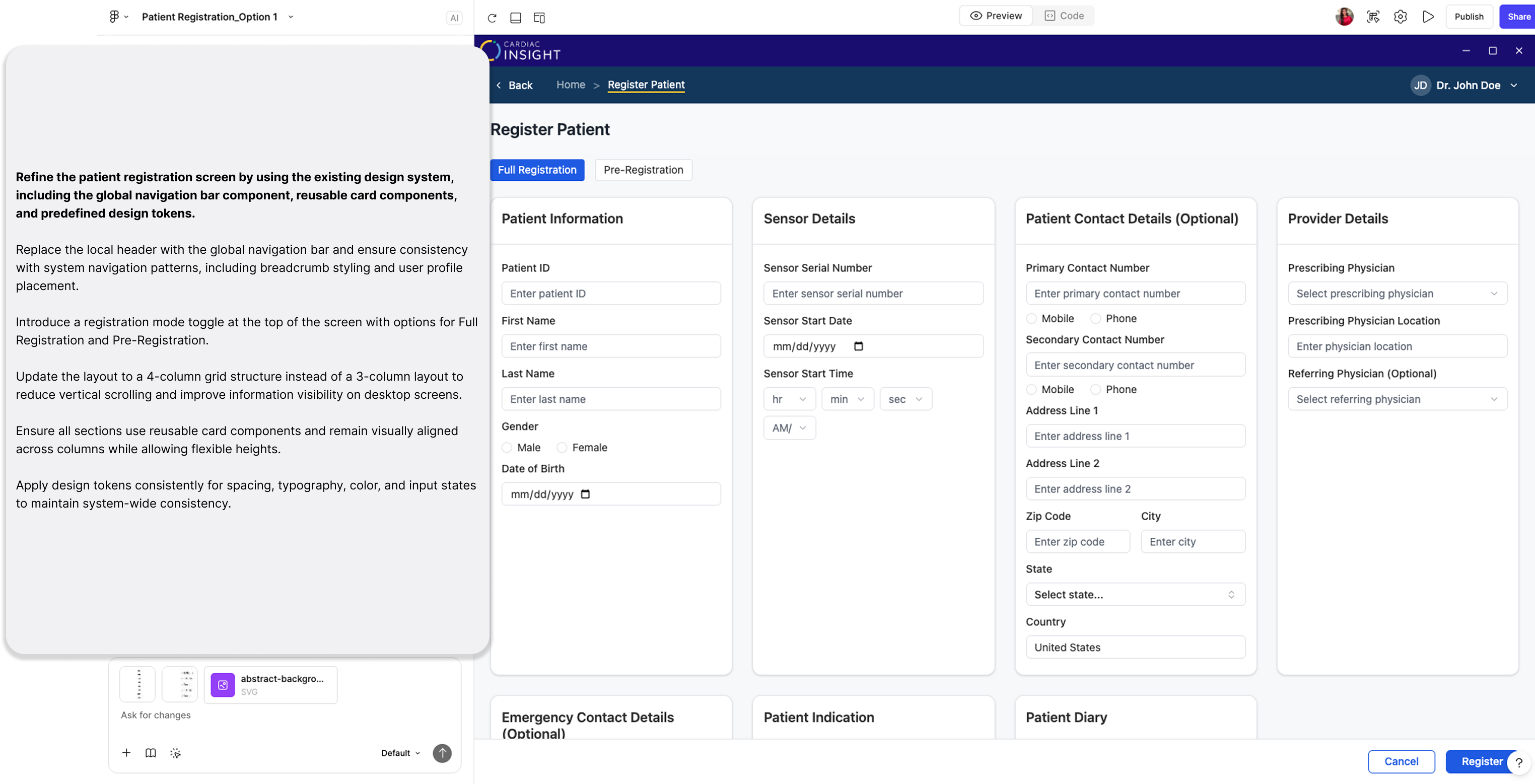
Three sessions on a single screen. Each image is the full Figma Make output. The breakdown below it explains what the prompt included and what changed.

Figma Make — Session 01
Session 01

What I added this session

Clinical context — what Cardea Solo is, who uses it, and what this specific screen needs to do in their workflow
Two user states: a brand new patient with an empty form, and an existing patient whose details may already be partially filled in
Screen connections: what happens before and after, so the React output would be structurally compatible with the rest of the system
Output: then I edited it

A working form came back — functional, but the layout and visual decisions were off. I corrected it in Figma Design and used that as the starting point for session two.

06 / Design System

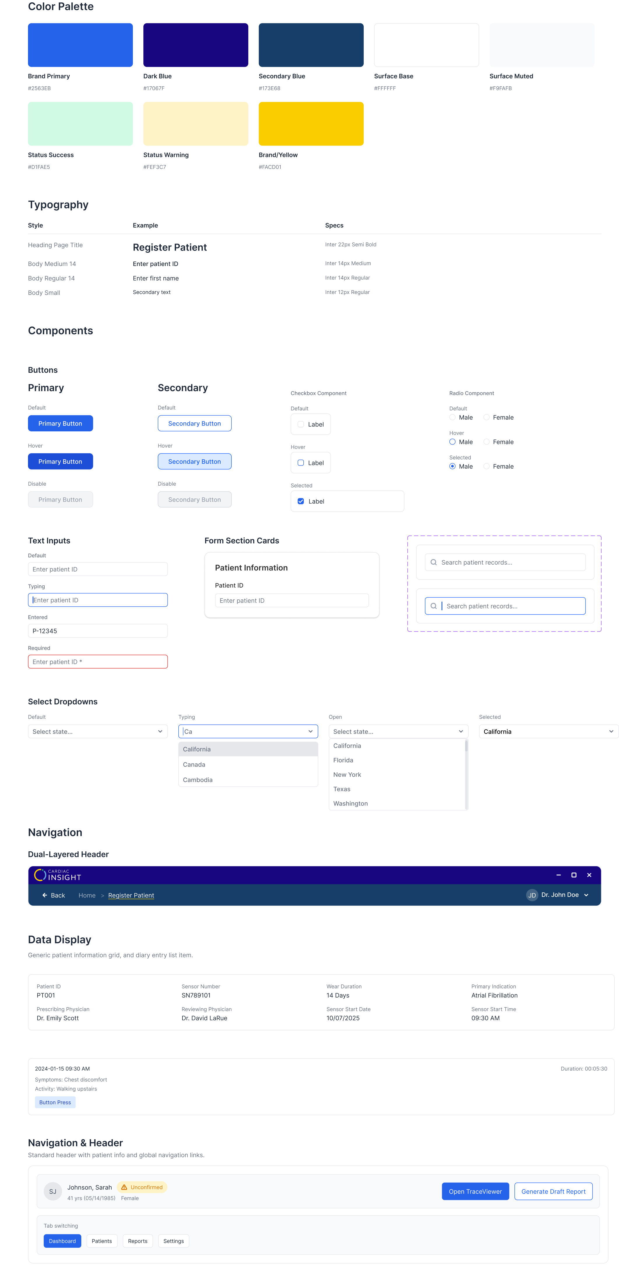
A glimpse of the master component library.

Every screen that went through the loop added components: colour tokens, typography, buttons, inputs, dropdowns, form cards, navigation. All documented. All state-complete. All built from real approved screens.

Figma Design — Master Component Library
100%
Master Component Library
i Use + / − to zoom · Click and drag to pan
What was handed to engineering
Not a spec. Working React code of the entire system.

Every prompt was written with the data architecture in mind: patient state, field dependencies, role-based permissions. Any addition or change in the system reflects at all related places. The behaviour was designed at the prompt level, so the React output was structurally sound before engineering touched it.

Figma Make — React output
07 / Outcomes

What the MVP delivered.

These numbers come from step-counting the old flow against the redesigned one, grounded in the IA audit that started the project. Not a usability study. The audit made the baseline real.

3x
Faster report generation for cardiologists
100%
Workflows role-scoped per persona
0
External tools in the physician flow
0
Tab switching across the redesigned system
5→1
Redundant workflows consolidated into one
Design Deliverables
Fully functional interactive prototype
12+ primary workflows across three user roles. Shared with stakeholders for review and used directly in usability testing.
React base code
Generated by Figma Make from approved designs. Handed directly to engineering to build on.
08 / Reflection
The hardest moments

The conversations were harder than the design

The hardest part of this project was not the design work. It was making the case at every stage: for a bigger scope, for a structural fix over a visual one, for why the users' experience mattered to the business. Those conversations were the real work, and they happened in a company where no designer had ever existed before.

What I learned about process

Preparation is the design

When you are clear on what you want to build and why, the actual building goes fast. All the time I spent on research, IA, and wireframe validation before touching Figma Make meant every session had a direction. I was not figuring things out inside the tool. I already knew what I was building.

A skill I built over six months

Using AI in design takes practice

I came in knowing the tools but not really how to use them well. The early sessions were a lot of trial and error. But six months of prompting a live clinical product teaches you things quickly. By the end I had a much better sense of what makes a prompt actually work and what makes output miss. That understanding is something I built. It did not come with the tool.

The biggest challenge and the most unexpected learning

Domain knowledge has to be earned, not assumed

Designing for a clinical ECG product without a medical background meant I had no frame of reference for what the workflows actually felt like in practice. No documentation could fix that. So I talked to everyone around me: engineers, QA, support, and every end user I could get time with. Those conversations were where I picked up what the software actually meant to the people using it daily. The design got better every time I stopped assuming and started asking.