Product Designer AI / Agentic UX Human-in-the-Loop

Witness: an AI-powered 3-way match workspace that sits between Amazon Business and a company's ERP, so finance teams catch invoice problems before they become payment mistakes.

Procurement happens on one platform. Payment happens on another. Amazon Business, NetSuite, SAP, email, spreadsheets. The invoice, the purchase order, and the receipt all live in different places, and someone has to hold the whole picture in their head. Witness is that single intelligent layer. It pulls the three documents together, does the matching, and flags what's off. The human stays the final decision-maker, always.

AI UX & Agentic Product Design
Built the design system in Figma, the design.md spec & the interactive prototype end-to-end
Figma, Claude & GitHub
The Witness dashboard, live prototype

At a Glance

Witness is a concept product for accounts payable teams who process invoices against purchase orders and receipts, the classic "3-way match," using Amazon Business as the purchasing platform and an ERP like NetSuite or SAP S/4HANA on the other end. Instead of switching between four or five systems to reconcile one invoice, everything relevant lives in one workspace, and AI does the first pass of the matching while a person makes the call.

🧾
Designed For
Accounts Payable Specialist or Finance Professional
The person who works the invoice queue every day: matching, resolving exceptions, and clearing what AI already handled.
What the Brief Assumed

Give finance teams an AI that does 3-way matching for them.

What Research Actually Found

People didn't want AI to do the matching for them. They wanted it to do the tedious cross-checking and then show its work, because the accuracy of a payment decision is their responsibility, not the tool's.

My Role

Product Designer. I built the design system in Figma, generated the design.md spec, and built the interactive prototype end to end, from information architecture through a working multi-page HTML/CSS/JS build.

Interaction Design Information Architecture Design System Agentic / AI UX Prompt Engineering Prototype Development Usability Testing
Designed in Collaboration With
Product Manager UX Researcher Design & Engineering Partner
Before → After
Today, Without Witness
Open Amazon Business for the PO, then the ERP for the invoice, then email for the receipt
Manually compare quantities, prices, tax, and freight line by line
No way to tell if a similar invoice was already paid
Discover duplicate or mismatched invoices after the fact
With Witness
PO, invoice, and receipt pulled into one workspace automatically
AI runs the 3-way match and shows exactly where it does or doesn't line up
Duplicate and near-duplicate invoices flagged with a confidence score
A person reviews the evidence and makes the final call, every time
How This Was Built

Figma for the design system and screens, Claude for translating that system into a working prototype. I directed every decision; the tools moved faster.

Figma
Design system, screen layouts, and component library. The source of truth for every token
Claude Code
Turned the Figma design system into a design.md spec: tokens, type, spacing, and component rules
Claude
Built the prototype in vanilla HTML, CSS, and JavaScript, screen by screen, reviewed and edited by hand
The Prototype

A full multi-page interactive build on realistic, simulated accounts-payable data. Three moments from it, click to play.

AI Assistant
Dashboard
Onboarding
AI Assistant
Ask a question, get a suggestion, or hand off an action, in plain language, right inside the workspace.
Dashboard
Where the day starts. Invoices triaged by what needs a person right now, not by list order.
Onboarding
How a new user learns what Witness does, then sets up their workspace and chooses their autonomy level.

This interactive prototype includes the following workflows.

🚀
Onboarding
What Witness is, new user setup, existing user sign-in
📋
Dashboard
Daily triage and priority queue
💬
AI Assistant
Ask, Suggest, and Do, three modes of one agent
🧾
Invoice Detail
Match evidence, discrepancies, recommended action
📂
All Invoices
Full queue, filterable by status and vendor
🔀
Autoflow
Autonomy set per workflow step
🛠️
Autoflow Editor
Configuring rules behind each step
🏢
Vendors
Vendor records and match history
⚙️
Settings
Workspace and account preferences
Impact

What this design gets right today, and what it's built to deliver at scale.

1 vs. 5
One workspace, not five tools. The PO, invoice, and receipt in one place instead of scattered across systems.
80%
Less manual matching. The reduction this design is built toward, in line with the category at scale.
Human, Always in the Loop
Always in control. Autonomy is set by the user, not decided by the AI.
1:1
Traceable, not taken on faith. Every AI action links back to its original source document.
Reflection
The real design problem

Not "can AI do the match." It's "how do you let AI do the match without the human losing the thread of why."

What changed my direction

Making the AI feel active, like named agents at work, not a quiet background feature.

What's still in progress

Role-based views for AP specialist, controller, and approver: the next thing I'm designing, not a finished feature yet.

The full story: the research, the pivot, what I built, and how AI became part of the build process itself.

01 / Research

The brief said "build AI matching." Research said the real work was earning trust.

Before sketching a single screen, I wanted to understand where a 3-way match actually breaks down for the people who do it every day, and how much of that was a fragmentation problem versus a trust problem.

1
Secondary Research
Grounding
  • ·Cognitive load and task-switching literature
  • ·Amazon Business workflow walkthroughs
  • ·Competitive analysis of procurement and AI-assisted tools
2
Scoping Interviews
n = 4
  • ·Identified workflow friction
  • ·Narrowed scope to post-purchase
3
Survey
n = 15
  • ·Directional read on fragmentation
  • ·Directional read on AI trust
4
Follow-up Interviews
n = 4
  • ·Day-to-day process
  • ·Decision-making and pain points
5
Journey Mapping
Synthesis
  • ·End-to-end confidence mapping
  • ·Located where trust drops
Users trust a system more when it explains itself clearly, and lose confidence fast when uncertainty is communicated poorly, or not at all.

Three findings kept surfacing across the survey and interviews: people were constantly switching systems to reconcile one invoice, they had no centralized view of payment status, and they didn't trust AI enough to hand off a financial decision without checking it. The next section breaks down exactly what that meant for design.

Voice of research
"[AI] makes mistakes. It makes mistakes on every part. But as I said, it's my job to make sure that AI does the work correctly." Interview participant

That single line reframed the whole project for me. The job wasn't to build an AI that never makes mistakes. It was to build a system where a mistake is easy to catch, and where the human never has to wonder what the AI actually did.

A journey map from requisition to payment confirmed where confidence drops hardest: invoice generation, 3-way matching, and payment approval. The exact moments where a wrong call carries a dollar amount. That's where I focused the design.

Where confidence drops across the journey
CONFIDENCE DROPS HARDEST HERE HIGH LOW Requisition Approval PO Generation Receiving Invoice Gen. 3-Way Match Payment Appr.
02 / Problem

Four problems kept surfacing. Only one of them was about the interface.

None of these needed a prettier screen. They needed a different structure: one workspace, transparent reasoning, and a way for people to control exactly how much AI does.

01

System Fragmentation

The same invoice lives in four places at once, and reconciling it means opening all four, every time.

02

Low Trust in AI

Accuracy is the top concern in financial workflows. People won't hand off a decision they can't verify.

03

Data Inconsistencies

Manual entry errors and vendor discrepancies create repeated verification work and email back-and-forth.

04

No Centralized Visibility

No single place shows payment status, blockers, or compliance state, so people track things twice.

The Pivot

The obvious brief: automate the match.

An AI that runs 3-way matching and outputs a pass/fail reads well on paper. It also asks a finance professional to trust a black box with money leaving the company.

What the research actually asked for.

People wanted AI to do the tedious cross-referencing, then hand back a clear, checkable answer, evidence attached, so a human could sign off with confidence, not blind faith.

That distinction shaped every design principle that followed: the system should centralize the fragmented workflow, keep every AI action transparent and explainable, and always leave the final authority with the person, not the model.

Design Principles

North Star

Human-centered control

AI assists through recommendations and automation. Final authority always stays with the person.

01
Centralize the fragmentation

Pull everything about one invoice into a single, coherent view instead of five open tabs.

02
Transparency in AI assistance

Every AI action is predictable and explainable. The person can see why, not just what.

03
Security & trust

Data is handled reliably, and every recommendation is dependable enough to act on.

03 / IA & Design Process

Built around one person. The one who works the queue every day.

Witness is designed for the Accounts Payable Specialist or Finance Professional who processes invoices day in and day out. The dashboard, the chat agent, and the duplicate catch are all built for that one job.

🧾
Primary Persona

Accounts Payable Specialist / Finance Professional

Works the invoice queue. Reviews matches, resolves flagged mismatches, and clears the routine cases AI already handled.

  • Needs to know what to look at first, not just what exists
  • Needs source documents one click away, not buried
  • Needs to trust that "handled by AI" still means reviewed
Where this persona sits in the workflow
SOURCE Purchase Order SOURCE Invoice SOURCE Receipt PRIMARY PERSONA AP Specialist WITNESS AI Runs the 3-way match Shows its reasoning CLEAN MATCH Cleared by AI EXCEPTION Sent to specialist
04 / Prototype

What I built. Live, not mocked up.

Every screen below is the actual working prototype, running inline, not a screenshot. Built on realistic, simulated accounts-payable data. Scroll inside any frame to explore it.

Dashboard
AI Chat Agent
Invoice Detail
Autoflow
AI Activity
Onboarding
01
Triaged by priority, not list order

Invoices sort into "must handle today," "waiting on others," and "handled by AI." The question isn't what exists, it's what needs a person right now.

02
"Handled by AI" still shows what needs review

Testing showed people assumed AI-handled meant fully done. I added a visible review count so no one is surprised later.

Witness Dashboard, walkthrough
The single feature people react to most

The Witness agent answers in plain language, right inside the workspace. Ask about an invoice, a vendor, or a payment status, and it retrieves the answer instead of sending you to go find it.

02
Context-aware, not a generic chatbot

Ask about INV-1027 and the agent pulls that invoice's actual history, its PO, its match status, and its flags, live from the workspace it's sitting in.

03
Always available, never in the way

The same chat panel follows the user across every page, so context never resets when they move from the dashboard to an invoice.

witness-chat.js in action
01
Recommended action sits at the top

Approve, dispute, reroute, or escalate. Surfaced first, so the next step is visible without scrolling.

02
INV-1027: a confidence-scored duplicate catch

Witness flags INV-1027 against Praxis Logistics as a likely duplicate of a previously paid invoice tied to PO-7718. Confidence score and financial exposure stated plainly: a $890 double-payment risk.

03
Original evidence, above the fold

The source invoice image sits before the AI's reasoning, so the primary document is checked first, not last.

Invoice Detail, walkthrough
01
Autonomy is a dial, not a switch

People wanted moderate to high automation, but disagreed on how much supervision they needed. Autoflow makes that adjustable per step.

02
Vendor rules are optional, not required

Testers were split on per-vendor control. I made vendor-specific autoflow opt-in, not a forced step.

Autoflow, walkthrough
01
Every AI action, logged with its reasoning

Trust links directly to explainability. The log shows what happened, why, and when, for every invoice.

02
Undo is a first-class action

If AI got a match wrong, reverting it is one click from the log, not a support ticket.

AI Activity, walkthrough
01
Learn, then set up

Four screens build understanding before any configuration. Four more make it real: connect tools, set preferences, choose autonomy.

02
Autonomy is chosen on day one

Assist: surface what matters, human decides everything. Draft for review: AI prepares, human approves. Handle it: AI runs it end to end and reports back.

Onboarding, walkthrough

Assist

"I surface what matters. You review and decide everything." Lowest automation, highest oversight.

Best for: new vendors, high-dollar invoices, or the first weeks after setup, anywhere trust hasn't been earned yet.

Draft for Review

"I prepare the action. You approve before anything happens." The middle ground most people land on.

Best for: routine vendors with an established pattern, where a quick approval beats a full review.

Handle It

"I take care of it end to end and keep you informed." Highest automation, for low-risk, high-confidence cases only.

Best for: a repeat invoice from a trusted vendor that has matched cleanly before, with nothing unusual flagged.

05 / Build Method

Figma set the system. Claude turned it into a working product.

I wanted a prototype real enough to usability-test properly, not a click-through of static frames. That meant building an actual working front end, and using AI to do it faster without giving up design control.

STEP 1 · DESIGN Figma System & key screens STEP 2 · SPEC Claude Code design.md tokens STEP 3 · BUILD Claude HTML, CSS, JS + layout variations STEP 4 · REVIEW VS Code + GitHub Hand-edited, tracked
Design

Figma

The full design system, plus key screens like the Dashboard designed in detail, so the AI had a concrete design language to follow, not just a token list.

Step 1
Spec

Claude Code

Generated a design.md file from the Figma system: tokens, colors, typography, and spacing rules documented as a spec.

Step 2
Build

Claude

Built the prototype from that spec, following the reference screens, including a few design variations for select screens before I picked and refined the final direction.

Step 3
Review

VS Code & GitHub

Every AI output reviewed and hand-edited for correctness before it shipped; version control kept design decisions traceable.

Step 4

Stack, accurately: vanilla HTML, CSS, and JavaScript. No framework, no build step. Nine full pages: dashboard, all invoices, invoice detail, autoflow, autoflow editor, AI activity, vendors, settings, and onboarding. It's never processed a real invoice, every number in it is simulated.

06 / Design System

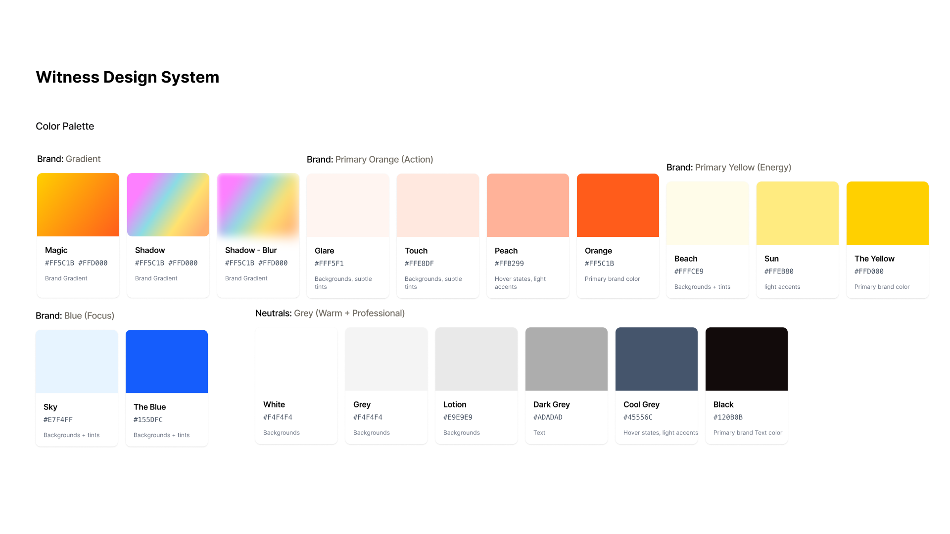
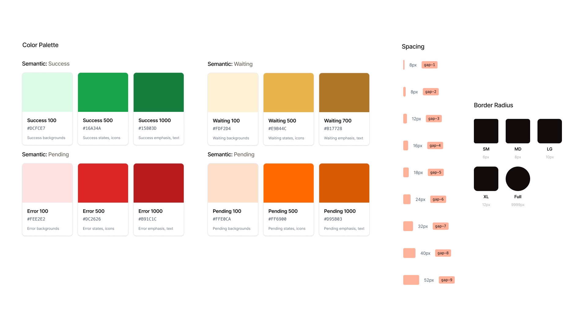
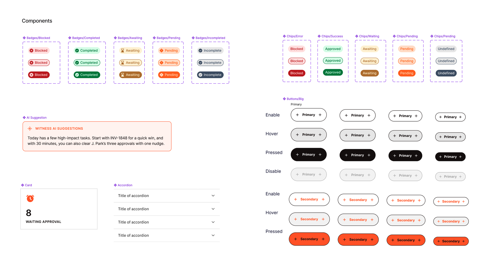
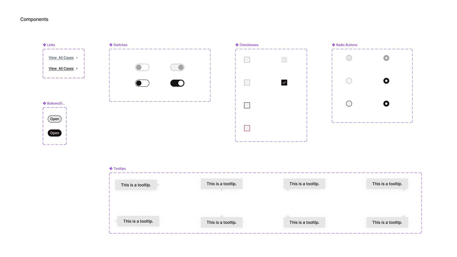
A restrained system, built for a financial tool people need to trust.

Warm and confident rather than sterile, with enough restraint that a duplicate-invoice warning still reads as urgent rather than decorative.

Witness design system, page 1
Witness design system, page 2
Witness design system, page 3
Witness design system, page 4

Shared Components

💬

witness-chat.js

The chat panel shared across every page, so the agent's context follows the user rather than resetting per screen.

🕓

Dynamic Date System

A shared data-wt-date attribute keeps every "3 days ago" and due-date label accurate and consistent across all nine pages.

Witness Mark

An 8-ray sunburst rotated 45°, used as the product's logo across onboarding, sign-in, and the workspace.

Design system built and documented in Figma; extracted into code via Claude Code and hand-maintained across the prototype.

07 / Usability Testing

Usability testing outcomes. What changed, and why it mattered.

I ran moderated think-aloud sessions with domain experts in procurement and accounts payable, walking through two scenarios: an invoice AI handled overnight, and one requiring mandatory human review. Here's what changed as a direct result.

What I NoticedWhat I ChangedWhy
Duplicate & exception alerts were easy to miss Made key alerts visually louder: stronger color, larger text Trust
Invoice detail page felt dense, next step buried Moved secondary info into tabs, and surfaced the recommended action at the top Clarity
"Handled by AI" read as fully done, no review needed Added a visible count of items still requiring review Trust
Testers split on whether vendor-specific rules should be mandatory Made vendor-specific autoflow an optional setting Control

Findings from 3 domain-expert usability sessions on a working prototype using simulated data.

08 / Reflection

What I'd build next, and what I chose not to build.

What I rejected, and why

A single "AI confidence" number

Early explorations reduced everything to one trust score. I moved away from it. A single number hides which part of a match is uncertain, and financial decisions need the specific mismatch, not a vague percentage.

What I rejected, and why

Full automation as the "premium" tier

It was tempting to frame "Handle It" as the best option. I didn't. Higher automation isn't higher quality. It's a tradeoff the controller should make deliberately, per vendor and per risk, not a ladder to climb.

Next: the disagreement flow

Designing for when AI is wrong

Every screen right now shows AI being right. The highest-value thing I haven't built yet is the flow for when a person overrides a flagged match: what that correction looks like, and how it teaches the system.

Next: role-based views

Scoping the AP specialist, controller, and approver screens

An AP specialist and a controller shouldn't see the same screen. It's sketched, not shipped, the honest next step, not a finished claim.

What I actually learned building this: writing a prompt for a financial screen is the same discipline as writing a design brief. Vague input gets vague output, and the quality of what Claude produced tracked directly with how precisely I'd already thought through the interaction. AI compressed the build. It didn't replace the judgment about what should exist in the first place, that decision, on every screen, stayed mine.